A modern evolution of an established brand.
A strategic evolution of the existing brand, introducing a refreshed visual language and a redesigned website while preserving the familiarity and trust built over time.
/ THE STARTING POINT
An established brand ready for its next chapter.



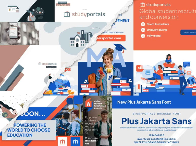
Studyportals already had a recognisable identity, so the goal was never to start again. The foundations were there, but over time the visual language had become limited and didn’t always translate well across the growing number of formats and channels we were designing for.
I approached the refresh by looking at what was worth keeping and where the identity needed more room to grow. Colour, typography, imagery, illustration and iconography were refined and expanded, while familiar elements of the brand remained in place. The result was an evolution rather than a reinvention, giving us more creative flexibility without losing what people already recognised as Studyportals.



/ VISUAL IDENTITY TRANSFORMATION
Before and after the rebrand.
The refresh kept the parts of Studyportals that were already recognisable. The mission, values and core identity stayed the same; what changed was the visual language around them.
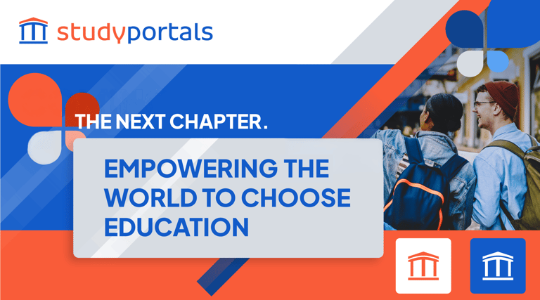
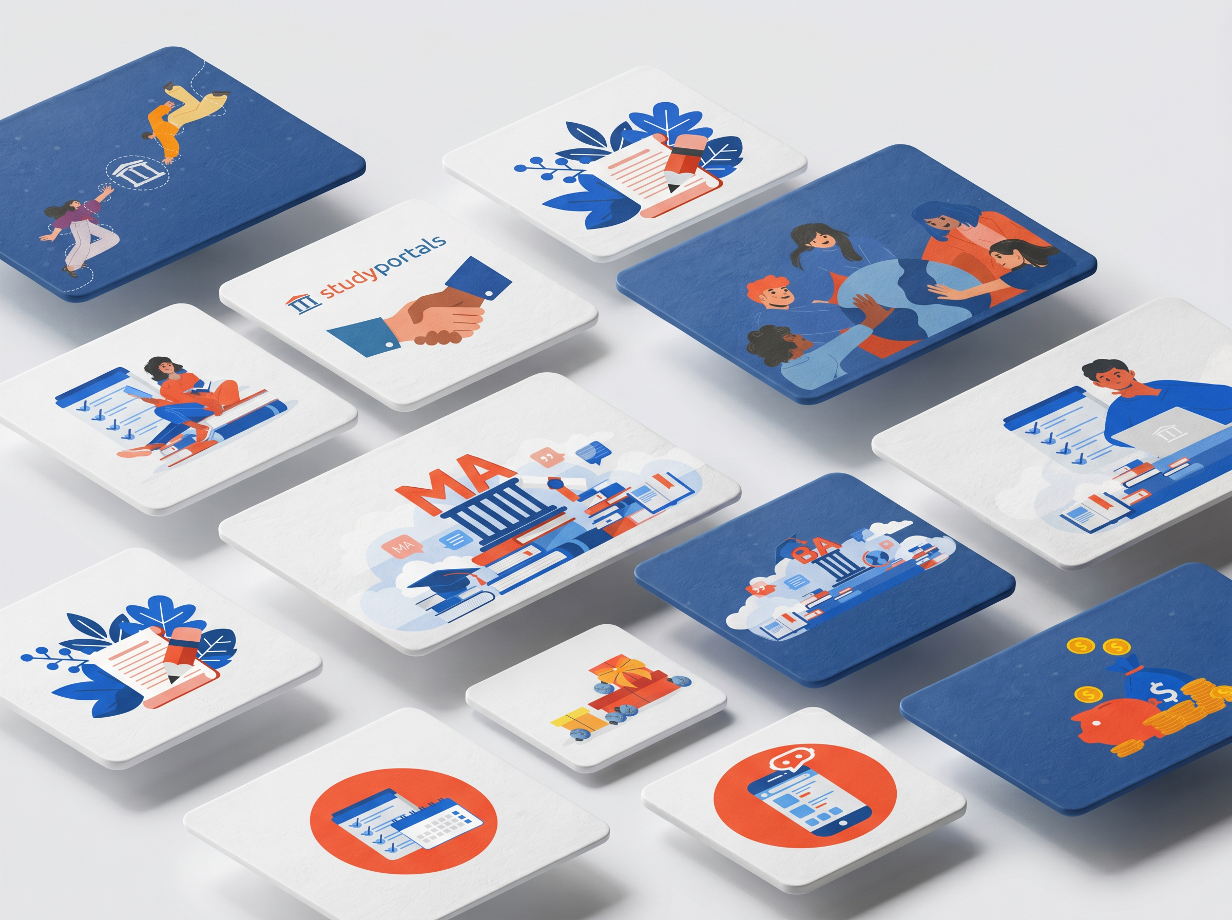
I introduced a brighter blue that worked better alongside the existing orange and gave the illustration style a new direction. A/B testing also influenced the illustration style. People responded better to characters that felt more expressive and human, so I used that insight when developing the new illustrations. The graphic elements changed too. I replaced the harder, more rigid forms with softer gradiant shapes that were easier to work with across the brand.
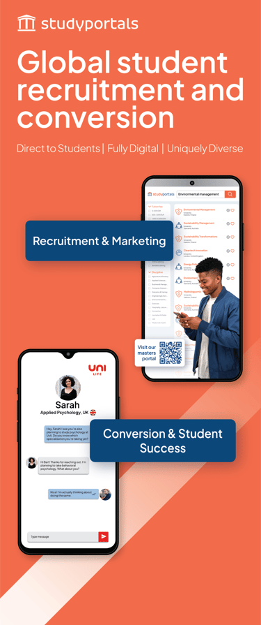
These changes were gradually carried through the website, campaigns, print and conference materials. At events, the strong orange presence was deliberately kept because it was already closely associated with Studyportals. Instead, I updated the layouts, messaging and supporting visuals around it, allowing the brand to feel new without becoming unfamiliar.








BEFORE
AFTER


/ INFRASTRUCTURE BUILT
The system that keeps the brand alive.
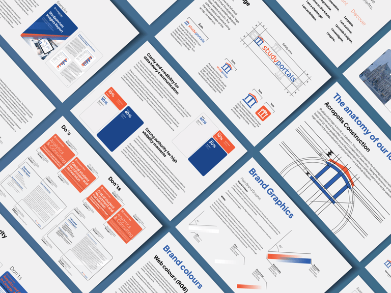
The refresh didn’t stop with the visual identity. I also looked at how the brand would be managed and used day to day, which led to a new Brand Hub, DAM structure and a library of templates across the tools our teams already used.
This became a project of its own, covering everything from asset management and templates to workflows, governance and training. You can explore the full Creative Infrastructure case study below.

A good brand system should leave some room to play. For the fourth edition of The Taste of Diversity, I took the visual language somewhere very different, using childhood nostalgia as the starting point. The cookbook became a scrapbook of handwritten notes, sketches, layered photography and family inspired collages.
The rules were still there. This was just one of those projects where knowing them meant knowing exactly how far I could bend them.


/ BRAND FLEXIBILITY
When the system allows for play.


MEASURABLE OUTCOMES
Faster workflows. Fewer off-brand materials.
A Stronger Visual Language.
More Creative Flexibility.
Recognition Retained.
The refreshed colour palette, illustration style and graphic elements gave the brand a broader and more distinctive visual vocabulary.
The expanded identity gave us more ways to design across campaigns, digital, print and events without every piece needing to look the same.
Established elements, including the logo and distinctive orange, remained part of the identity. The brand could evolve without losing the things people already recognised.